Visual identity · Basics
Logo
Our logo has evolved over the years but its soul remains the same. The two dots at the opposite ends of the logo typeface represent investors and companies, with Inderes in the middle connecting those two ends.
Logo variations

Download


PNG logos are optimal for fixed-size display on screens. SVG logos are the best choice for print and web usage, as they maintain high quality and are scalable.
Dos and don'ts
Do
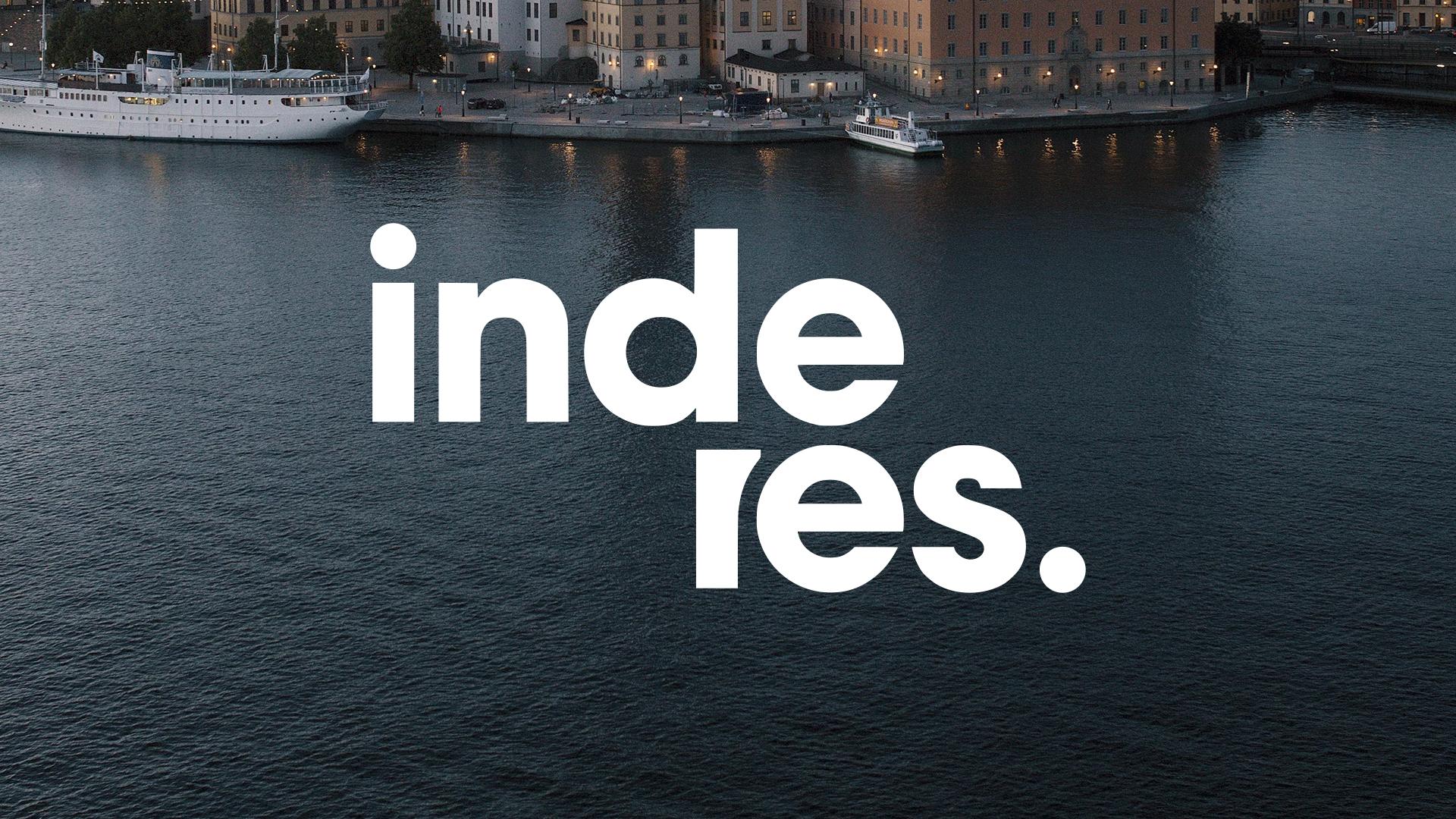
Use the white logo version if using an image as background.
Don't
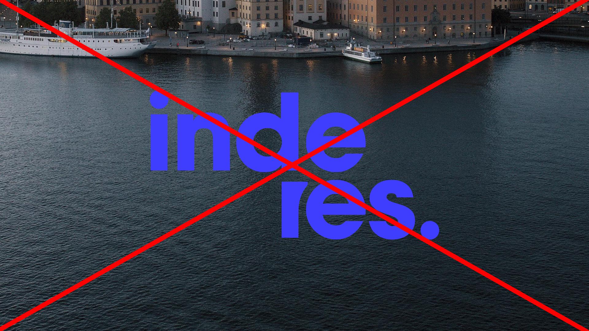
Avoid using the blue logo over dark photographs. If you use the logo with imagery, ensure it remains clearly legible.
Safezone
To ensure the logo is always clear and impactful, a minimum clear space (or safe zone) should be maintained around the logo. This space is equal to the height of the logo's capital letter 'e' or another defined element in the logo. No other text, images, or graphic elements should intrude into this area. This rule helps maintain the logo's integrity and ensures its visibility in any context.
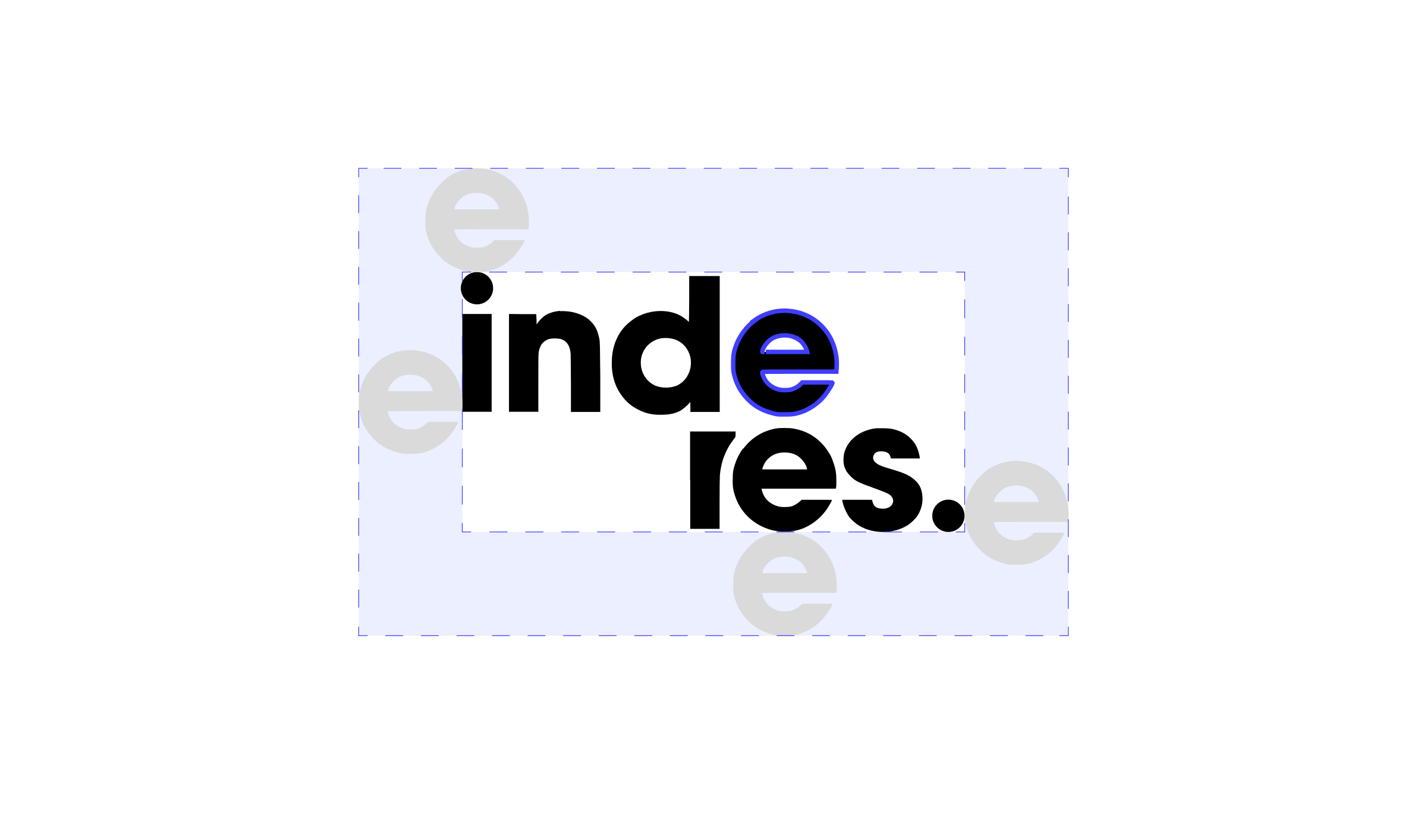
The dashed area shows the minimum clear space on all sides.